


A successful retail store isn’t just a lineup of products and that furniture stuff. It’s more like how everything is arranged, where items can be reached, and how the process flows while people are walking, browsing, and buying. Those details can nudge customer movement, change product visibility, and shape the whole shopping mood.
So, retailers should really pause and think about how glass display cabinets, open shelving, till counters, and a checkout counter fit together. In practice, the right blend can make a layout feel polished, help safeguard valuable merchandise, and also make everyday operations run more smoothly.
Instead of picking one display option for the entire store, businesses can mix different fixtures for different tasks and zones.
Why Should Retailers Combine Different Display Solutions?
- Different products need different presentation methods: Not everything works with the same exhibit.
- Open shelving is great for browsing: It encourages people to reach, compare, and explore products on their own.
- Glass Display Cabinets provide protection: They suit valuable items, delicate merchandise, or premium stock where they should still stay visible but guarded at the same time.
- Till counters support quick and easy transactions: They also give a practical workspace for payment systems and staff routines.
- Checkout counters improve customer flow: If the checkout is placed well, it makes the whole buying process feel smoother without blocking the walkways or messing with movement around the store.
- Create distinct retail zones: By combining different fixtures, they can create distinct retail zones, like separate browsing from featured areas and then clearly into the checkout section.
- Improve the overall shopping journey: Customers can move naturally from discovery to selection and then finally to payment, more naturally, like it just makes sense.
- Suitable for different retail environments: This approach works especially in jewellery stores, electronics shops, pharmacies, gift stores, convenience stores, fashion retailers and specialist retailers too.
Where Should Glass Display Cabinets Be Used?
When the item needs visibility but also wants protection at the same time, glass display cabinets tend to work best in that case. The transparent glass lets customers look at the merchandise without being invited to touch too much or have unnecessary handling. So, they’re a good fit for high-value goods, delicate items, collectibles, and premium merchandise in general.
Some retailers even go a step further with illuminated display cabinets, because the light becomes a quiet “anchor” in the aisle. With the right lighting direction, you can pull attention toward specific products without making the rest of the store feel crowded or overly bright.
Also, the overall look matters. The cabinet design should blend with the store interior, not fight it. Frameless glass, aluminium frames, timber finishes, and other variations can be chosen depending on the mood you want: modern, warm, minimal, or something like that.
The goal is pretty plain: make key items easy to see, while the display stays organised and secure, even when the foot traffic is heavy.
When Do Glass Display Cases Make More Sense?
Another practical merchandising option is glass display cases, especially when you want to spotlight a smaller selection rather than offering open access. You can place a display case against a wall, set it as a freestanding feature, or build it into a wider retail display system.
The closed-in layout comes with benefits that are hard to ignore. It can lower accidental damage, keep control over access to valuable merchandise, and keep the presentation looking neater overall.
Retailers also lean on display cases for seasonal collections, new arrivals, or limited edition pieces that you really want to keep front and centre. That said, glass displays are not meant for every situation. If shoppers need to pick up, compare, and rethink products often, open shelving might be a more convenient approach. In most stores, the best retail layout is a mix of accessible browsing plus controlled product presentation, just balanced enough.
How Should Till Counters Fit Into the Store Layout?
Till counters are the heart of the transaction process, but their job can spread out a bit more than just holding the payment stuff – ok, not only that.
A well-designed till counter gives you room for point-of-sale systems, payment terminals, receipts, packaging materials, and also the practical tools staff need. It should even let employees greet and help customers in a smooth way, especially when it gets busy and noisy.
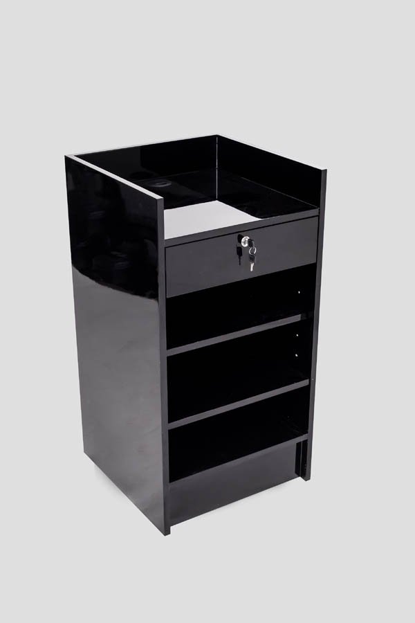
And yeah, the placement is just as important as the design itself.
If till counters sit too near the entrance, it can cause a bottleneck; people slow down, and then you get that uncomfortable congestion. But if they are pushed too far into the store, the checkout route can feel less obvious and not intuitive, like customers are guessing. So retailers should think about how shoppers move through the space, what floor area is really available, how queues form, and whether the till area stays accessible for everyone before deciding where that checkout zone should live.
How to Create a Good Checkout Counter?
A thoughtfully created checkout counter should balance practicality with the visual identity of the store, not just be “there” in a plain way. It’s often one of the last points customers hit before leaving, so it becomes a noticeable part of the whole shopping experience.
A functional checkout area should give enough working space while keeping cables, equipment and packaging materials organised. At the same time, it should also make room for payment terminals and other point-of-sale hardware without the counter looking messy or cluttered, like everything is piled up.
Retailers can also lean into the nearby space for carefully selected impulse items. Small accessories, complementary products, or seasonal things can sit near the checkout, as long as they don’t block customer movement or interfere with staff access to products. This approach works especially well for frequently purchased goods, like books, clothing, and accessories.
How Can the Right Combination Improve a Retail Store?
Honestly, there’s not one fixture that works 100% for every retail situation. Glass display cabinets can guard and also make premium items stand out, while glass display cases do a more controlled presentation. Then there’s open shelving, which keeps things easy to scan and explore. And till counters—those are a quick way to handle checkout and move customers.
When you plan it well, a good checkout counter brings all that together at the very end of the customer journey.
If retailers mix accessibility, product protection, visual merchandising, and sensible point-of-sale design, they can end up with a place that’s simpler to walk through, more organised, and even more engaging for customers.
So ultimately the question isn’t really glass displays vs open shelving vs counters. It’s how those pieces work in tandem, so the whole retail experience feels better, not just one part.

