


Much has been written dismissing the humble pie chart. Data visualization pioneers and authors such as Edward Tufte have advocated that pie charts be relegated to the history books. However, as the examples below will illustrate, there are still some cases pie charts are superior to alternatives such as bar charts. The more important lesson is to always think before you chart, and we fully agree with that sentiment!
It is often difficult for humans to interpret pie slices due to their angle, size and number of pie slices. Visualizing the same data with different chart types such as pie charts and column charts show the issue immediately:
Pie Charts Vs Column Charts
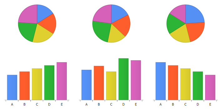
In these three examples the same data is shown using a pie chart and then again below the same data is visualized with a column chart. The column values and trends (increasing, mixed and decreasing) are clearly visible at a glance, yet this information is difficult or impossible to view in the corresponding pie charts above. Bar and column charts enable viewers to see relative trends and do a quick comparison of similar values. They are also suitable for time series where pie charts only address a specific comparison at one point in time.
3D Pie Charts
The problems with pie charts are further exasperated with the use of 3D pie charts. In this case, we side firmly with Tufte and Stephen Few and suggest to avoid them completely. The normal issues of a 2D pie chart are compounded with a 3D perspective that makes it even more difficult to actually compare data points. To the right, you can see a data set compared with a 2D and 3D pie where the perspective change creates the illusion that the pink and yellow slices are the same value.
Other issues are apparent as pie slices get smaller, it is difficult or impossible to differentiate between individual slices and the pie slice borders end up taking much of the pie making identification by color or legend entries even more challenging.
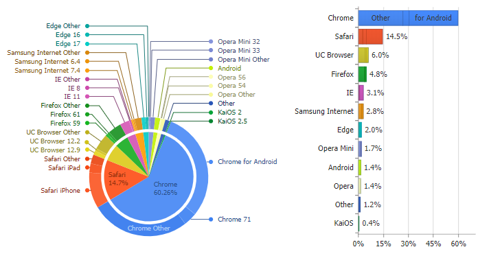
Pie Slices and Stacked Column Charts
Gauge and Donut Chart Evolution
As with everything, there are bad pie charts and good pie charts. The concept has seen a resurgence with the advent of circular gauge charts popularized with the release of the apple watch fitness rings. In the past this type of chart has been emulated with donut charts with two series one for the active area and the other for the remainder. This circular gauge chart is effective for at a glance comparisons so long as the axis scales are fixed (in the fitness case, one full rotation is always 100% of the daily target). It can also be motivating to see rings animate around in excess of 100%.

Some have derided donut charts as the worst of both worlds, having the poor comparisons of the pie charts while losing the angle information a traditional pie chart would have without the whole. However research by Robert Kosara has found that people don’t actually read angles from pie charts and the effectiveness of pie and donut charts are comparable. Donuts also offer the option for more space for interior labeling.
Pie Chart Advantages
With different data, use of pie charts can actually be more intuitive for data comparisons than their bar chart counterparts. Here are some charts from a paper by Ian Spence and Stephan Lewandowsky[1] who studied visualization effectiveness of pie charts compared to horizontal bar charts, and regular bar charts. They found for cases of comparison where people had to combine multiple values visually they could do this more easily and intuitively with pie slices to estimate totals than bar segments.

Study participants were timed viewing the charts on the left and tasked to answer questions as accurately possible about individual values and comparisons of combined values. As you can see from the results chart on the right, there are cases where pie charts are more effective for estimations and comparisons.
While such studied show a slight edge to pies in certain comparison tasks, a traditional strong-hold for pie charts is comparing two values that make up a complete whole such as yes/no survey results or voting result percentages.
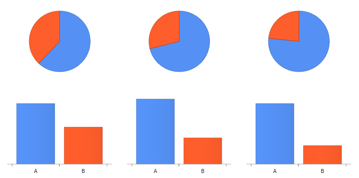
So if you are comparing values that make up a whole, a pie chart may be just what you need to effectively communicate your data. Here you can see values compared easily and see that estimating the values with column charts is much more challenging.
Conclusion
Pie charts have their place in modern data visualizations and even excel in certain areas, but need to be used with caution. Avoiding 3D pies and use pies when comparing two values that make up a whole is the best usage. For other cases, think carefully about your data and the tasks your users need to accomplish. If grouping and comparing multiple values is key, pies also may be an advantage, but if spotting trends across values or visualizing data values that are similar, bars and columns are a much better option!
References
- 1. Displaying Proportions and Percentages – https://classes.engineering.wustl.edu/cse557/spring2017/readings/displaying-proportions
This article was originally published on JSCharting.

